Visualization early preview
Datazenit is currently in alpha version. Closed testing has begun and tonight we think it's time to shed some light on one of the key features of Datazenit: visualizations. We are planning to release Datazenit with at least six types of charts: line, spline, scatter, pie, bar and area chart. The range of charts will be continuously extended. Community will be able to extend functionality for Datazenit, e.g., via 3rd party plugins.
Some of the already available settings of visualizations can be seen in the examples below – it's a select from a movie rental database.
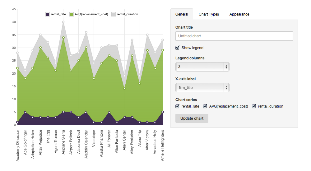
Visualizations can be edited in the settings box alongside, the changes appear in real time. The same goes for editing the select query – data set is updated instantly.
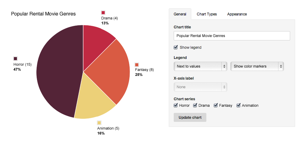
Visualizations can be customized by adjusting pre-defined chart themes, line width, opacity and curve smoothing options, legend positioning and format, labels on axis, resizing chart & more.
This is our first post in a series of upcoming insights into Datazenit leading up to the beta test. Stay tuned!